Saturday, August 18, 2018

gilmour avenue :: main floor


One of the major selling features of the house was how open the main floor is. With older Toronto homes, most often, the main floor is divided into several rooms and it's a daunting task to imagine opening it all up, and the structural implications tied into renovating a hundred year old house. The old owners took care of the dirty work for us and really invested in lovely finishes for the space. 

With a coat of paint, a few new furniture pieces and some styling, we made the space our own and I really feel like it reflects our personality. I will admit that I've found myself at several times over the past year sitting in the space and happily gushing to D and how much I love our home! 


I wanted to keep the front entry simple and welcoming. We bought this rod iron console table and got a custom piece of stone for on top - it cost a fraction of what it would have in a retail store and is sleek and elegant. 
D's grandad painted the stool and it came from his family's cabin - it's the perfect spot for people to take off their shoes or rest their purse.


This blue chair was a hand-me-down from my late grandmother. It used to be burnt orange and my in-laws had it reupholstered as a gift for me years ago. 


I saw this print on another house tour and fell in love with it. I bought it and had it mounted and it hangs on two simple gold clips. We love being by the water and I find the print so calming.


We decided to buy a new sectional to give the living space a new look.  It took us time, but we really searched for each piece we added into the space to make sure we had found something that felt right and was worth the investment. 


This bookshelf came from our old apartment and is still such a functional, yet stylish piece. I color coordinated our book collection and have added some greenery. Insider tip, I usually have a candy dish on one of the shelves filled with little treats.


We bought this chest of drawers at a church sale for $6. We refinished it and it now holds all sorts of hosting accessories like napkins, candles and place cards. The planter was a slam-dunk wedding gift from one of our best friends. 


My cousin built us this gorgeous black walnut, live edge table as a wedding gift. It is the feature piece when you walk in the front door and we can fit ten comfortably around it. 
We bought the chairs online and thankfully they all worked beautifully together. I love how the blond highlights on the table match the lighter wood on the chairs. 


Our booze collection exceeds anything we could fit on a bar cart, so this little round version is perfect for holding little treasures. The stump print is our newest piece of artwork and came from a young artist at the One of a Kind Show. The second painting is of the northern lights by D's grandad. 


I finally understand the saying, 'the kitchen is the heart of the home'. Anytime we have friends over, we end up congregated around the island, usually snacking and socializing. 


There's a huge amount of both cupboard and countertop space in the kitchen. It's been great for storing all of our things away and out of site and allowing for some fun styling of prettier things on the countertop. We love cooking together and it's a comfortable space that we get to enjoy together.


A little space for tech. We almost always have music playing on the bluetooth speaker and the iPad is in easy reach for recipe referencing.


At the other end of the main floor, we have our mud room. Most often we'll enter this way, coming from the garage or the bus stop and it's spacious with room for lots of shoes and jackets. It's right off the kitchen, so it's also perfect for hosting backyard parties.


+ + + + + 

Here's what it looked like before...

We painted the entire space and switched out the pendant lights over the kitchen island (one was cracked when we moved in). We have a new pendant fixture for over the front door that's waiting to be hung and I'd like to find a new fixture for over the dining table and maybe even swap out the cabinetry hardware. Little updates that have a big impact.


Friday, August 17, 2018

fall sneaker


I love a good, casual sneaker. They can be dressed up with a cute dress or worn with jeans and a t-shirt. I love these Bobbies, a brand from Paris, that are chic and apparently super comfortable. 
Now, just to decide between pink or tan...best part, they're on sale!


when vegetables need to be paired with chardonnay


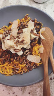
We hosted friends for wine club last night and the chosen feature wine was chardonnay. We marinated and barbecued pork tenderloin and I wanted a satisfying veggie dish to serve along side the wine that was rich but not too heavy. I referenced this pairing guide, and after browsing the grocery store for ten minutes came up with a new vegetable dish that was a big hit and super easy to throw together!

:: Here's how I made it ::

:: To start, I cubed sweet potato, marinated with curry, chili powder, garlic powder and salt and roasted at 375 for 30 minutes.
:: I sauteed squash zoodles in a big fry pan with butter and lots of salt and pepper and layered that as the base of the dish. The sweet potato went on top.
:: Finished with lots of curled parmesan and a handful of chopped pecans.
:: I made a dressing that I served in a pitcher on the table. Combined mayo, lemon juice, red wine vinegar, salt - emulsify with olive oil. Chop up a handful of whatever herbs you have and add. (We have a herb garden in the backyard, so I added oregeno, parsley, basil, dill and rosemary)

Thursday, August 16, 2018

wedding wardrobe


We have back to back wedding weekends coming up at the beginning of September. We've had a wedding-less summer so I'm looking forward to dressing up and celebrating with friends! I picked up dresses for both weddings during end of season sales at Club Monaco and Banana Republic and scored two pairs of earrings on mega sale at J.Crew last week. The first wedding is at a resort on Lake Simcoe. I'm going to pair this dress with black, lace-up espadrilles that are easy to walk in and a simple, black clutch for a casual summery look.

gilmour avenue :: third floor


The third floor of the house has two guest rooms and a powder room and is currently reserved for guests at Hotel Gray :) It's awesome having extra bedrooms and we've loved being able to host friends and family. 
 Without a doubt, the third floor under went the biggest transformation. I really wanted to have fun with these spaces and I'm so happy with how the designs came to life. We debated investing in the spaces at first, simply because they weren't going to be used a lot but we didn't have much work to do elsewhere in the house and so we went for it. 


I had my heart set on shiplap for one of the rooms. It was the more expensive of the upgrades and was a lot of work (thanks Mom!) but it is such a unique finish for the space. The room is painted a medium grey and feels so cozy and intimate.
 I decorated mostly with things we already had at our old place - the bedding from our bed, old side tables (we scored at a church sale for $25) and the cow skull that hung over our TV.


 The Moroccan wedding blanket was a wedding gift from a group of friends. 
It was such a thoughtful present and little did they know, I had always wanted one! 


We replaced the ceiling light fixture, got new reading lights and recently installed the blind so guests can sleep past 6am.


The powder room is undoubtedly the sassiest room in the house. Drew gave me creative freedom in the space and I really went for it. (I still can't explain why I chose papaya for the walls.) I had originally intended on using the dot decals for the guest room with the wainscoting but it was more cost effective to use them in the smaller space. 


The black and white accents play off the bright walls so well. 
I love seeing everyone's reaction when they see the space for the first time.


We added wainscoting in the second bedroom and while I had intended on painting the upper drywall, we ended up liking the way the space looked all white. We had white bedding already and added accents with black, white and green. 


I always want friends and family to feel welcome in our home, so we try to make it feel like a hotel. It's all in the details.


As you'll see in the floor plan, we have some great added storage in the guest rooms. The access panels are hidden in the shiplap and wainscoting. 

+ + + + + 

Here's what it looked like before... 
The bathroom wasn't photographed, but it was just plain white.