Sorry for the delay in the rest of the house tour! Toronto had some major flooding last week, and my job as a condo property manager has been seriously busy! But I'm excited to share our little house tour, so back to regular programming...
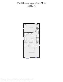
Our new house has four levels and other then the main floor, the second floor is definitely where we spend the most time. The master bedroom and en suite is so spacious and feels so luxurious to return to each night. The bathroom at our old apartment was less than ideal (ie. we squished around each other for four years), so it makes this new space feel that much more wonderful.
In terms of layout, we have laundry at the top of the stairs which is very convenient, especially given how steep the stairs are. There is a second bedroom on the same floor which currently is set up as an office and closet (and will one day be converted into a nursery). It serves as a great overflow space for drying laundry, packing for trips and wrapping gifts.
+ + + + +
M A S T E R B E D R O O M
We added the coffered wall detail in the master bedroom. It was an inexpensive update and really changes the look of the bedroom. We painted the room out in the same color and splurged on an upholstered king size bed.
You may notice that the windows are at different heights. I installed the drapes at the same height to trick the eye into enlarging the smaller window. When I came up with the idea, I was quickly reminded that curtain panels are often sold by the piece, which can get very pricey. These curtains came from Ikea and work really well. They're simple but I think they make the room feel fancy!
The Ikea Pax wardrobe was left behind which has been a life saver for storage. It serves as an oversized dresser and linen closet, all in one. My favorite part is the jewelry inserts. My jewelry was stashed away in boxes at our old apartment, so it's so nice to have everything laid out so I can see everything.
The master bedroom is connected to the ensuite via the walk in closet.
There is a second door into the ensuite from the second floor hallway.
E N S U I T E
The master ensuite was finished in bright white marble and needed little work. We painted the space a lighter grey and installed this double storage cube for a modern look with added storage.
O F F I C E
Given this space will transition into a nursery, we didn't want to spend a lot of money on styling and furnishing the space. I found this marble wall paper and had it mounted and framed, which was a great, inexpensive way to fill the wall space.
My sister made this wall piece and I love having it on display.
You can see it hanging on the office wall as you come up the stairs.
It's hard to believe but this desk used to be the dining table in our old apartment.
It works well for its new purpose and is the perfect spot for studying and work.
These figurines were brought back from Hong Kong by my grand mother.
My mom let me have them and I absolutely adore them.
This was my cute solution for sorting all my wrapping paper, tissue and ribbons.
This print came from Hopgoods Foodliner, our favorite restaurant on Roncesvalles that closed shortly before we moved. It was a two minute walk from our apartment, the food was delicious and the service was the friendliest in the city. When we found out they were closing, we asked what they were doing with this piece of art. The chef owner's father had taken the photo at the beach in Nova Scotia and framed it for him. We ended up rolling it up and carrying it home the night the restaurant closed after our last dinner. I love this piece so much an all the memories it holds for us.
This landing and staircase leads to the third floor.
Floorplan
+ + + + +
In case you want to see what it looked like before...


No comments:
Post a Comment